Friday 18 December 2009

Organisation.

So I like making lists, never manage to cross everything out on them mainly because I lose them or do not see them enough to keep the 'to-do' fresh in my mind...thanks to swissmiss there is a webpage known as TeuxDeux...

I highly recommend it, so simple in layout and ease of use. Its not just for designers, anyone who likes to know what they need to do or should over the next week or two, give it a go. It's free as well.

STOP FUCKING SMOKING!!!


For the past two years I have been a culprit of making many feeble attempts at giving up smoking...

- lent
- new year resolutions
- birthdays
- promises...

but over the past week I contracted a very very nasty dry cough, making me physically stop smoking..awwhh diddums, I've had to stay indoors so what do to...THE INTERNET!! Anyway, whilst surfing the net (am i the only one who says that nowadays :S ) I rediscovered Martin Brents photography collection...

really like his sports related shots and most relevant to the here and now for me, the anti-smoking campaign shots...

bring on the new years resolutions.


Monday 7 December 2009

k-POW!

Here it is ladies, a final yet not so final copy of the video we've made for World Aids Day, footage throughout the day and a sneak peek at our encounter with Gail. nom nom nom.

1st December (World Aids Day 2009) from Ade Curcher on Vimeo.


Thursday 3 December 2009

Kingston: Weather Research


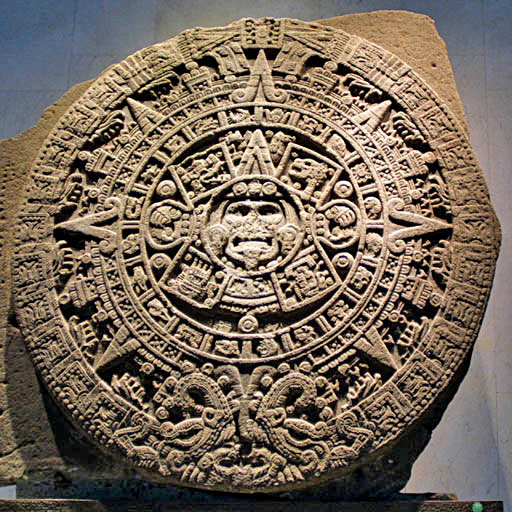
This latest project will need alot of research and experimentation. For an early idea I'm thinking of the Aztecs and how they linked the weather with religion. After doing some quick net research I've discovered that there were Gods dedicated to different roles and that most had a link with the sun and the most commonly known Aztec Sun God - Quetzalcoatl. This Sun God had a lot of power and choice over who would succeed him, giving them tests to pass inevitably ending in death.

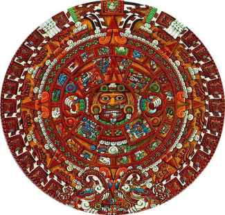
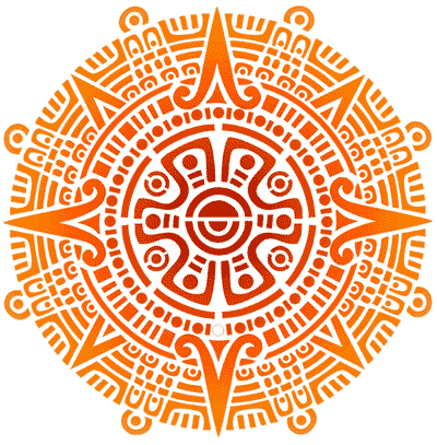
The artistic skill granted to the Aztecs is outstanding, such delicacy in their patterns and forms. A form I have seen plenty of is the circle this cylindrical form offers a meaning to the way that the Aztecs thought about the Gods and the weather cycles.

I want to play around with the beautiful forms and patterns created by the aztecs and providing that i can find appropriate research, create my own hopefully leading to a more developed, concise idea.

- Work with traditional designs; meanings of patterns and shapes.
- Apply to tattoo, stone, print, sketch, plaster, wax?
- Colour pallette; research which colours relate to weather.

Use these sites:

World Aids Day


So after a week and a bit of ideas, development, test, making and organizing World Aids Day came around like a flash. The day itself was full of emotion, from excitement to exhaustion we made our mark and had a good go at raising money and awareness for the Terrence Higgins Trust.

Our idea was based on a paper chain that is linked by the red ribbon associated with World Aids Day. These machine cut figures were sprayed/painted white to provide a blank canvas for those who wanted to modify their contribution to our chain. Our slogan was 'Join hands against Aids' and with each donation we would add another figure to our chain.

We found that groups of students and kids who were on a school trip were really interested in what we were doing, so after traveling from St Pauls to Southbank and ending up by the Seven Dials by Covent Garden we found our calling.

Laying our chain around the monument caused much attention and as the light faded the headlights gave the figures a spotlight which was admired by many. We were graced by a brief appearance of Gale Porter, the ex tv presenter who contracted alopecia areata and has dealt with a lot of troubles in her life, this presence gave us a huge boost to such an exhausting day.

A project which even though it was treated like any other, held something much more in its application and outcome. Check out the blog later this week for our video compilation from the day

Tuesday 24 November 2009

Kingston: Bookbinding


After going along to the Small Publishers Fair two weeks ago, chatting to an amazing French Man and his lovely Korean wife I became engrossed in the ways you can bookbind. I may have also spent my weekley budget that Saturday! Here I've got a few snaps of what I managed to make over the duration of the week.

'My Perfect Sketchbook' - Perfect is defined individually I feel and I wanted to make a sketchbook that I feel comfortable using in many environments, It has a theme of red black and white, my perfect colour theem, grey/white alternating pages to draft and finalise work on, a couple of acetate insers as well as some tracing paper and semi-transparent sheets to work on.

One of my favourite projects so far, mainly for the playful, hands on factor.

Sunday 15 November 2009

Kingston: 2D/3D Type


Each member of the group were given a word which we then had to express through differrent questions such as "What colour do you imagine your word to be?" or "What would it look like if it was set lustfully, angrily, orderly?"

I felt those excercises helped me think about the infinite ways one word can be put into context, we were then given the task of going away for 2 hours and producing an A1 Sheet with our word in an expressive form from what we had learnt as well as putting it into a 3D context.

My word was Durable.

I was happy with the 3D context with the idea of shoes having durability and representing this through the colour and condition of each. My A1 sheet however was rushed in that 2 hour mindframe but i still think it has visual appeal.

Kingston: Introducing Type


Bauhaus93.

Had to research the background, appropriatness and then produce a poster in Indesign summing up what we had learnt. I went for the distinct and clean qualities of the type with a light blue colour theme

Private Work: Phoenix


As you do... talking to my chiaropractor one day after the session and we got chatting about inspiration, I told him about what I do and he was moving house and wanted a piece for his gym so he can look to it whenever he wants to 'up his game' or 'reach the peak.'

So I went away with this idea of using some sort of mythological creature as they always seem to be worshipped or seen as something you'd want to be reincarnated as! I chose a phoenix for its free fly qualities, how when its seen to soar into the skies there are no limits.. so after sourcing an image, tracing and photoshopping a bit I felt that it worked well but it wasn't quite finished.
I went back to my mark making sheets and picked out one I called 'spineless energy' for its fragmented/shattered feel. I placed it beneath the phoenix and fell in love with the image, so did he.

He wanted his favourite quote along the bottom, which I now carry in my mind whenever I feel that I'm not up to scratch, enjoy :)

Foundation Work: FMP


Propagrandeur; the title for my final major project. Setting myself the task of creating bold propaganda pieces which also had a artistic feel to them. A hard concept to achieve I found out, after extensive research and development, I directed my work towards the events of the G20 Riots, after hearing of stories from friends, online blogs, videos, imagery and interviews I found that it was disgusting the sort of measures used by the riot police.

I created two stencil posters of riot offices in uniform with a g20 logo to associate the imagery to the event. One image of a victim of the violence, quite a strong piece i felt, and one sticker which related to the recession and bankers.

Over a duration of two weeks I posted these works around my town, acquiring feedback from a varied audience. I found that the local authorities were not too happy about these works and after a few days removed dutifuly, although those more concealed held up for a month or two.

I felt that the outcomes were strong in their finish and content but in relation to my initial brief, I personally feel they wern't as bold as they could have been, probably down the to the detail in the pieces, simplicity would have been more effective and thats why I can see why the victim image recieved the most positive feedback.

Foundation Work: Typeface


Like most foundation courses we worked with Type, I've always been fascinated with the intricacy put into making a well designed typeface. So here I've given it a try, focusing on turning an old gothic type into a dropcap type. Creating an overlapping basis for which the type fits ontop of.

I played around with positive and negative alot, whether the layer of the letter should match that of the detailed background which I felt would conceal the letter, offering the onlooker a harder time at recognising the letter. I also created an alternative where-by I chose to keep the letter have 100% opacity to make the typeface clearer.

I named my type 'Scintilla' after the latin translation for stencil, as each letter was hand-cut and pasted, a very time consuming process. Looking at both outcomes I prefer the type without the integration of the background in the letter. Let me know what you think :)

Foundation Work: Senses


One of my favourite projects of foundation. To create 5 banners for an human senses exhibition aimed at a range of ages and people with interests in the senses. I chose to go with a markmaking feel to my pieces, attempting to create marks that could be related to the sense itself. Scanning my strips into a pc then applying type and a short definition. I was pleased with the outcome as it gained positive feedback from fellow peers stating that they were aesthetically pleasing and the series all related.

Foundation Work: Facts & Figures


First graphic brief after choosing our specialist area. Focussing on my interest in graffiti, spray cans and the figures surrounding it. I found it quite difficult to acquire accurate figures on what I wanted to present, in the end I had to call up my local station and pretend I was doing an article for my local paper on the amount spend on graffiti to get a more accurate figure. I had to rack my brain to work out the figures for my 'one coat of paint' poster. Working out average square metre of spray from the average spray can. Definatly one of the most frustrating by the end of it all.

Foundation Work: 3D Design


The 2 day brief given to us was to design and create a coathook of sorts, which was themed to an interest of ours. I was and still am into my drum and bass music and had this vision of a turntable arm acting as the coat hook, so after popping to the charity shop and the old record store I had all the essentials to create it. After a few hours in the workshop I created my first coathook, how pleased I was!

The turntable arm could be lifted of its cuver metal rods and imitate the process of it playing the vinyl. It was a nice little project with a final piece that created a 'form over function' result I felt.

Foundation Work: Mark Making


After having little experience in mark making coming into this project, I fell in love with the freedom of the art. Here I'd like to share some of my final mark sheets, as well as two other earlier sheets made. Using studio gum, powder paint, ink, bleach and a range of drawing tools.

I didn't really work out why I needed to produce these sheets but they came in very handy for a private job I did over the summer as a background and have come in useful for many borders and sidepanels for sketchbooks and publishings.

Foundation Work: CCTVillians


After finally getting around to creating a blog, I'd first like to share some of my Foundation level work a range of different formats and mediums used to get across my ideas and thoughts on the projects set.

This initial piece was done in the early stages of the course where the brief stated that we were to try and express a personal issue or problem with something that we see around us everyday.


As I have an interest in the sheer amount of cctv camera's that are in place for our safety I figured I'd translate these thoughts through a stencil piece. The center icon being a 'hoodie' overlooked by several camera's, in my opinion and through research, cameras were put in place initially to stop minor crimes commonly associated with the youth. The figures scale is to gain focus of each of the cameras, and to offer the onlooker a sense of safety. I love creating really intricate stencils and I'm sure you'll witness a few more throughout this blog.